Let’s start with the main idea: it’d be nice to have an easy way to apply, remove, and, more importantly combine multiple animations on an element, without hand-crafting each animation separately, and without requiring bloated code. Something like this:
See the Pen
Composable Animations by tcmulder (@tcmulder)
on CodePen.
In-Depth Example
As an example, let’s say we have a heading we want to animate subtly when it enters the viewport. We could apply <h1 class="ani ani--opacity">Heading</h1> to fade it in, <h1 class="ani ani--up">Heading</h1> to animate it up, or <h1 class="ani ani--opacity ani--up">Heading</h1> to fade it in and animate it up. We could even do more complex things like <h1 class="ani ani--opacity ani--up ani--left ani--blur">Heading</h1> to have the heading subtly fade in, move up and to the left, and come into focus from blurred. And we can have many other subtle, combinable options to create an animation that’s really unique.
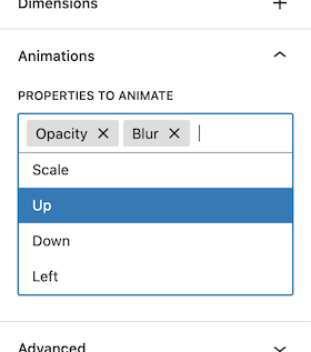
This need came originally from the sites I build on the WordPress platform: I wanted a way for clients to add or remove animations on things, and wanted it to be flexible so adding one animation didn’t cancel out others. So, I built a list of animations they could add, remove, and combine in various ways (all without requiring my assistance later to add new custom code for each animation).
Now, let’s look at the code. Say we have a heading, list, and image, within a couple of columns:
<div class="columns">
	<div class="column">
		<h1>Heading</h1>
		<ul>
			<li>Item One</li>
			<li>Item Two</li>
		</ul>
	</div>
	<div class="column">
		<img src="image.png" alt="Animated Image">
	</div>
</div>
We can create an intersection observer in JavaScript that looks for all elements on the page with a certain class, which we’ll call .ani; whenever one of these elements is visible in the browser’s viewport, we add a class of .is-shown, and whenever it’s not visible we remove that class.
const ani = (els) => {
	// bail if we have no elements
	if (!els.length) return;
	// create an observer
	const observer = new IntersectionObserver((entries) => {
        entries.forEach((entry) => {
            // toggle .is-shown based on visibility in viewport
            entry.target.classList.toggle(
                'is-shown',
                entry.isIntersecting
            );
        });
    }, { rootMargin: '10px 0px 0px' });
	// add all animatable elements to the observer
	els.forEach((el) => observer.observe(el));
};
ani(document.querySelectorAll('.ani'));
So, we can now apply animations to the heading, paragraph, and image independently like so:
<div class="columns">
	<div class="column">
		<h1 class="ani">Heading</h1>
		<ul>
			<li class="ani">Item One</li>
			<li class="ani">Item Two</li>
		</ul>
	</div>
	<div class="column">
		<img src="image.png" alt="Animated Image">
	</div>
</div>
For simplicity, I like to style everything how I’d like it to normally look, then define what it’s animating from; So, if we wanted to have the heading fade in and up, we could do the following:
h1 {
	color: teal;
	margin: 0.8em 0 0.5em;
	transition: 0.3s;
	&:not(.is-shown) {
		opacity: 0;
		transform: translateY(1em);
	}
}
Then, let’s say we want the list items to fade in and animate toward the right:
li {
	list-style: square;
	transition: 0.3s;
	&:not(.is-shown) {
		opacity: 0;
		transform: translateX(1em);
	}
}
But, instead of adding the animations to the CSS for the elements themselves, we could add them to our .ani class and various .ani--* customizations to cleanly separate animations from normal styling:
/* normal styling */
h1 {
	color: teal;
	margin: 0.8em 0 0.5em;
}
li {
	list-style: square;
}
/* animation styling */
.ani {
	transition: 0.3s;
	transform: translate(var(--ani-x, 0), var(--ani-y, 0));
	filter: opacity(var(--ani-opacity, 100%));
	&.ani--up {
		--ani-y: 1.25rem;
	}
	&.ani--right {
		--ani-x: -1.5rem;
	}
	&.ani--opacity {
		--ani-opacity: 0%;
	}
}
Then, we add appropriate classes to the HTML:
<div class="columns">
	<div class="column">
		<h1 class="ani ani--opacity ani--up">Heading</h1>
		<ul>
			<li class="ani ani--opacity ani--right">Item One</li>
			<li class="ani ani--opacity ani--right">Item Two</li>
		</ul>
	</div>
	<div class="column">
		<img src="image.png" alt="Animated Image">
	</div>
</div>
Without writing any more CSS or JavaScript, we can completely change how things animate just by applying classes:
<div class="columns">
	<div class="column ani ani--opacity">
		<h1 class="ani ani--up">Heading</h1>
		<ul>
			<li class="ani ani--up ani--right">Item One</li>
			<li class="ani ani--up ani--right">Item Two</li>
		</ul>
	</div>
	<div class="column ani ani--opacity">
		<img class="ani ani--opacity ani--up" src="image.png" alt="Animated Image">
	</div>
</div>
And, since I’m using WordPress, I can have Gutenberg let the client add these classes to whatever elements they’d like.
Let’s add more options:
.ani {
	transition: transform 0.3s, filter 0.3s;
	&:not(.is-shown) {
		transition: 0s 0s;
		filter:
			blur(var(--ani-blur, 0))
			opacity(var(--ani-opacity, 100%));
		transform:
			 translateX(var(--ani-x, 0))
			 translateY(var(--ani-y, 0))
			 perspective(var(--ani-perspective, 0px))
			 scale(var(--ani-scale-x, 1), var(--ani-scale-y, 1))
			 rotateX(var(--ani-rotate-x, 0deg))
			 rotate(var(--ani-rotate, 0deg))
			 translateZ(var(--ani-z, 0))
	}
	&.ani--opacity {
		--ani-opacity: 0%;
	}
	&.ani--scale {
		--ani-scale-x: 0.8;
		--ani-scale-y: var(--ani-scale-x);
	}
	&.ani--scale-x {
		--ani-scale-x: 0;
	}
	&.ani--blur {
		--ani-blur: 0.25rem;
	}
	&.ani--up {
		--ani-y: 1.25rem;
	}
	&.ani--down {
		--ani-y: -1.25rem;
	}
	&.ani--left {
		--ani-x: 1.5rem;
	}
	&.ani--right {
		--ani-x: -1.5rem;
	}
	&.ani--3d {
		--ani-perspective: 8em;
		--ani-rotate-x: 12deg;
		--ani-rotate: -2deg;
		--ani-z: 1.5em;
	}
}
In less than 50 lines of code I’ve just added a huge number of different animation combinations that you can apply to whatever elements you’d like.
We can still tweak these a little as needed. For instance, if scaling an H1 up from 0.8 as in our example above is too much, we can subtly change the animation just for H1’s:
h1.ani--scale {
	--ani-scale-x: 0.9;
}
Or, we can customize even farther. Turns out, if you add a custom property with an empty default like var(--ani-custom-transform, ) for example, we can optionally chain styling to the end of our transforms and filters. So, we can update our initial CSS to:
.ani {
	&:not(.is-shown) {
		transition: 0s 0s;
		filter:
			blur(var(--ani-blur, 0))
			opacity(var(--ani-opacity, 100%))
			var(--ani-custom-filter, );
		transform:
			 translateX(var(--ani-x, 0))
			 translateY(var(--ani-y, 0))
			 perspective(var(--ani-perspective, 0px))
			 scale(var(--ani-scale-x, 1), var(--ani-scale-y, 1))
			 rotateX(var(--ani-rotate-x, 0deg))
			 rotate(var(--ani-rotate, 0deg))
			 translateZ(var(--ani-z, 0))
			 var(--ani-custom-transform, );
	}

}
Then, we can optionally use those new --ani-custom-filter and --ani-custom-transform like so:
.ani {
    &.ani--3d-glasses {
        &:not(.is-shown) {
            --ani-custom-transform: skewX(10deg);
            --ani-custom-filter:
                drop-shadow(5px 5px 0 red)
                hue-rotate(220deg)
                drop-shadow(-5px -5px 0 red);
        }
    }
    &.ani--shrink-letters {
        --ani-property: letter-spacing, filter, transform;
        &:not(.is-shown) {
            letter-spacing: 0.1em;
        }
    }
}
The last step is variable-izing everything so it’s even easier to tweak settings per website or even per element within a website:
/**
 * Global animation configuration.
 *
 */
:root {
	--ani-duration: calc(var(--ani-speed, 0.375s) * 2); /* speed of transition effects */
	--ani-timing-function: var(--ani-ease, ease);
	--ani-delay-offset: 0.15s; /* start delay (so ani don't start at very bottom of screen) */
	--ani-delay-increment: 0; /* integer for stepping animations */
	--ani-delay-factor: 0.05s; /* duration of each increment step */
	--ani-property: filter, transform; /* properties to animate */
}

/**
 * Viewport-based animations.
 *
 * .ani animations occur once an element enters the
 * viewport, then reset immediately after that element
 * has left the viewport so it's ready to reanimate.
 */
.ani {
	transition-delay: calc(
		var(--ani-delay-increment)
		* var(--ani-delay-factor)
		+ var(--ani-delay-offset)
	);
	transition-duration: var(--ani-duration);
	transition-timing-function: var(--ani-timing-function);
	transition-property: var(--ani-property);
	will-change: transform;
	&:not(.is-shown) {
		transition: 0s 0s;
		filter:
			blur(var(--ani-blur, 0))
			opacity(var(--ani-opacity, 100%))
			var(--ani-custom-filter, );
		transform:
			 translateX(var(--ani-x, 0))
			 translateY(var(--ani-y, 0))
			 perspective(var(--ani-perspective, 0px))
			 scale(var(--ani-scale-x, 1), var(--ani-scale-y, 1))
			 rotateX(var(--ani-rotate-x, 0deg))
			 rotate(var(--ani-rotate, 0deg))
			 translateZ(var(--ani-z, 0))
			 var(--ani-custom-transform, );
	}
	&.ani--opacity {
		--ani-opacity: 0%;
	}
	&.ani--scale {
		--ani-scale-x: 0.8;
		--ani-scale-y: var(--ani-scale-x);
	}
	&.ani--scale-x {
		--ani-scale-x: 0;
	}
	&.ani--blur {
		--ani-blur: 0.25rem;
	}
	&.ani--up {
		--ani-y: 1.25rem;
	}
	&.ani--down {
		--ani-y: -1.25rem;
	}
	&.ani--left {
		--ani-x: 1.5rem;
	}
	&.ani--right {
		--ani-x: -1.5rem;
	}
	&.ani--3d {
		--ani-perspective: 8em;
		--ani-rotate-x: 12deg;
		--ani-rotate: -2deg;
		--ani-z: 1.5em;
	}
}

/*
 * Website-specific custom animations.
 *
.ani {
    &.ani--3d-glasses {
        &:not(.is-shown) {
            --ani-custom-transform: skewX(10deg);
            --ani-custom-filter:
                drop-shadow(5px 5px 0 red)
                hue-rotate(220deg)
                drop-shadow(-5px -5px 0 red);
        }
    }
    &.ani--shrink-letters {
        --ani-property: letter-spacing, filter, transform;
        &:not(.is-shown) {
            letter-spacing: 0.1em;
        }
    }
}
I’ve been able to copy the same code into multiple websites over the past few years, while keeping the animation combinations unique by utilizing different combinations and slightly tweaking default durations, distances, scales, etc. to achieve a different animation “feel” for each website I build.